The Crunch in San Francisco's Real Estate Market
Over the last 13 months, for a variety of compelling economic reasons, home-buyer demand in San Francisco has continued to grow ever stronger, while the inventory of homes available to purchase has only become tighter. This is the classic supply and demand dynamic -- increased competition for a scarce commodity -- that leads to increasing prices. Our inventory crunch, at least so far in 2013, is not easing. This situation is advantageous to sellers, and difficult and aggravating for buyers (and their agents): the time, effort, emotional energy and money that it takes to find and buy a home have all been increasing. However, if buyers can summon the patience and endurance to see the process through, they might take some solace in the last 2 real estate recoveries, in the eighties and nineties. As can be seen on charts further down, it’s not unusual for repressed buyer demand to explode after a long down market, creating the same rapid appreciation situation we are experiencing now. But even with increasing competition and rising prices, those who purchased in the first few years of the past 2 turnarounds ended up doing very well with their investments. We don’t know if this recovery will continue to follow the same trend lines as past market cycles, but it has thus far.
Is Everything Selling Over the Asking Price?
No, of course not: not all listings are selling for over list price. Some homes still go through price reductions and some don’t sell at all, but it is true that a large percentage of SF listings is now selling for over asking price and sometimes far over. This is especially the case with houses, where 1 in 4 sold in the past 2 months went 10% or more over the list price. (Note: Homes selling for within a quarter percent of the list price were considered to have sold AT asking price.)
And this chart shows the dramatic increase in median home prices in 2012:
New Listings vs. Accepted Offers
There are two issues behind the current low inventory crunch: firstly, there’s the simple matter of fewer listings coming on market, and secondly, that the listings that do arrive are being snatched up very quickly. This chart compares the influx of inventory and buyer demand in January of the last 4 years. Currently, on any given day, the choice of listings available to purchase is far below that of previous years -- which fuels fierce competition between buyers.
This chart illustrates the overall decline in listings for sale:
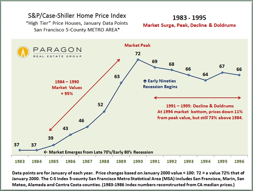
Perspective on Three Market Recoveries
This Case-Shiller chart for the 5-county SF Metro Area begins with the recovery following the market recession/ doldrums of 1991 - 1995. The market of 1996 and 1997 had basically the same dynamic of repressed demand exploding alongside a recovering economy that we’re experiencing today. (All chart numbers reflect a percentage of the home values in January 2000.) There followed a 100% increase in values over the next 5 years, even before the inflation of the big bubble of 2004-2008. Buyers who bought in the mid-late nineties ended up doing quite well.
This chart shows the same dynamic in the transition from the late seventies/ early eighties recession to the mid-eighties rebound. Those buying in the early years of that recovery also did pretty well, even factoring in the following recession and market correction:
Statistics are generalities and should be considered approximations: How they apply to any specific property is unknown. These analyses were performed in good faith with data derived from sources deemed reliable, but they may contain errors and are subject to revision. If you have any questions, please don’t hesitate to contact us.
© Paragon Real Estate Group, February 2013


